Visualizing data is becoming a much greater part of journalism. Large news organizations are creating graphics desks that create complex visuals with data to inform the public about important events.
To do it well is a course on it’s own. And not every story needs a feat of programming and art. Sometimes, you can help yourself and your story by just creating a quick chart.
Good news: one of the best libraries for visualizing data is in the tidyverse and it’s pretty simple to make simple charts quickly with just a little bit of code.
Let’s revisit some data we’ve used in the past and turn it into charts.
library(tidyverse)
── Attaching core tidyverse packages ──────────────────────── tidyverse 2.0.0 ──
✔ dplyr     1.1.2     ✔ readr     2.1.4
✔ forcats   1.0.0     ✔ stringr   1.5.0
✔ ggplot2   3.4.4     ✔ tibble    3.2.1
✔ lubridate 1.9.2     ✔ tidyr     1.3.0
✔ purrr     1.0.2
── Conflicts ────────────────────────────────────────── tidyverse_conflicts() ──
✖ dplyr::filter() masks stats::filter()
✖ dplyr::lag()    masks stats::lag()
ℹ Use the conflicted package (<http://conflicted.r-lib.org/>) to force all conflicts to become errors
Rows: 393 Columns: 4
── Column specification ────────────────────────────────────────────────────────
Delimiter: ","
chr (3): Cofirm Type, COUNTY, Date
dbl (1): ID

ℹ Use `spec()` to retrieve the full column specification for this data.
ℹ Specify the column types or set `show_col_types = FALSE` to quiet this message.
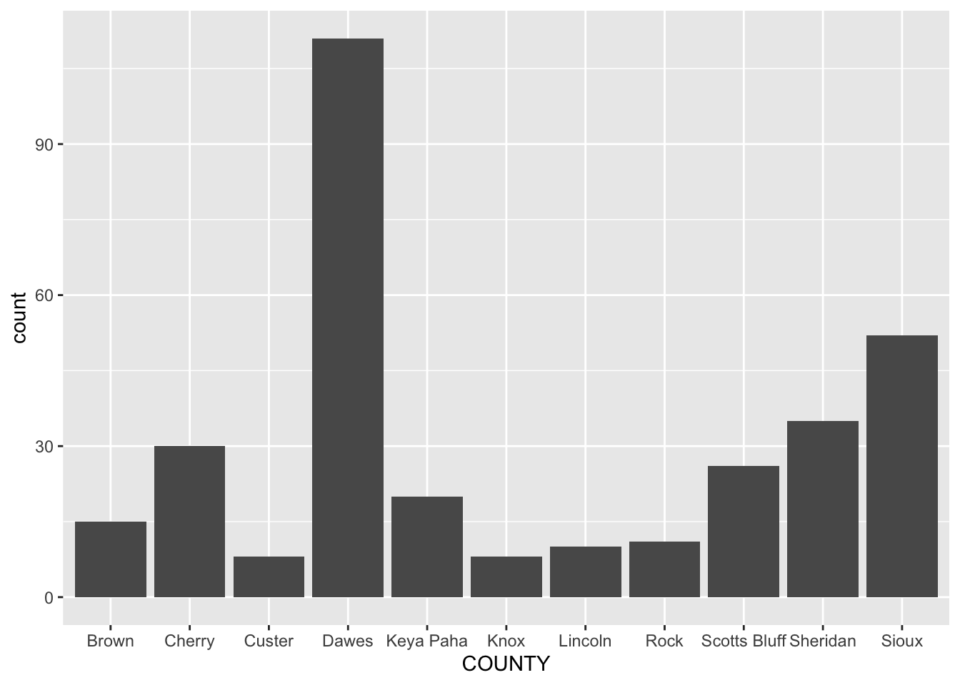
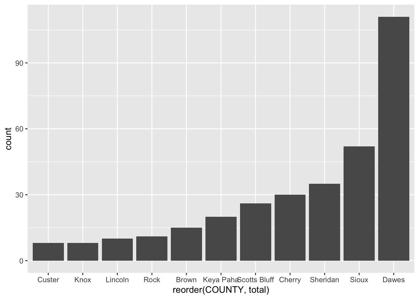
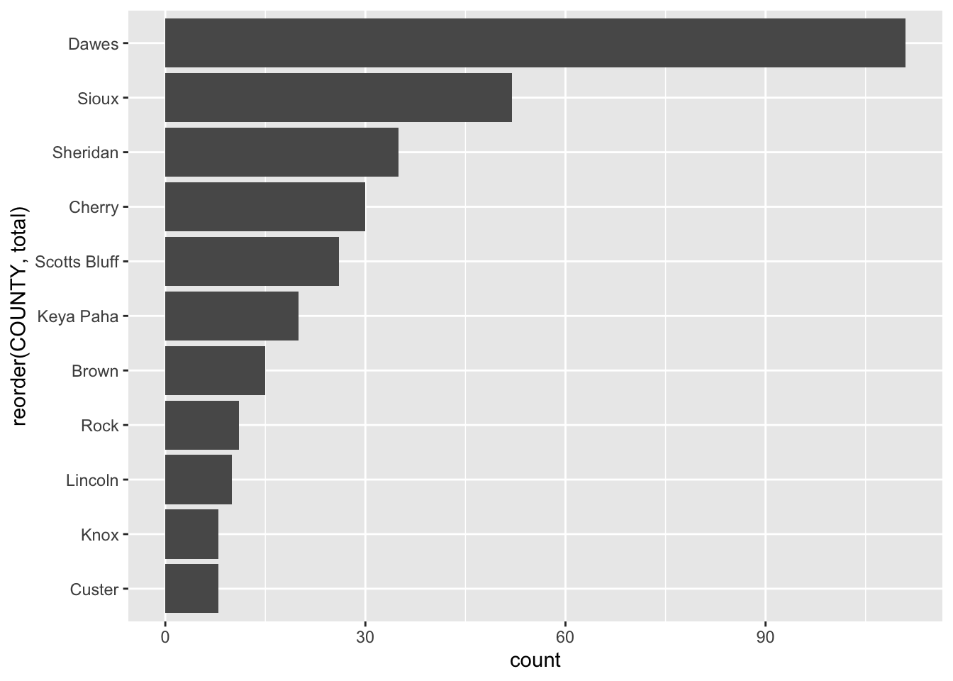
17.1 Bar charts
The first kind of chart we’ll create is a simple bar chart. It’s a chart designed to show differences between things – the magnitude of one, compared to the next, and the next, and the next. So if we have thing, like a county, or a state, or a group name, and then a count of that group, we can make a bar chart.
So what does the chart of the top 10 counties with the most mountain sightings look like?
First, we’ll create a dataframe of those top 10, called topsightings.
Now ggplot. The first thing we do with ggplot is invoke it, which creates the canvas. In ggplot, we work with geometries – the shape that the data will take – and aesthetics – the data that will take shape. In a bar chart, we first pass in the data to the geometry, then set the aesthetic. We tell ggplot what the x value is – in a bar chart, that’s almost always your grouping variable. Then we tell it the weight of the bar – the number that will set the height.
Art? No. Tells you the story? Yep. And for reporting purposes, that’s enough.
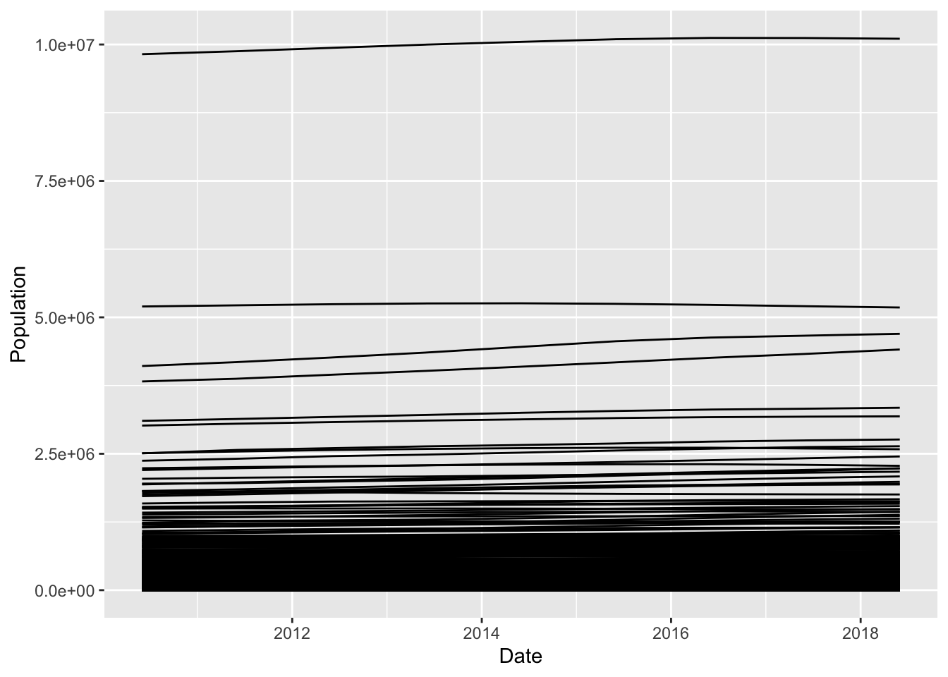
17.2 Line charts
Line charts show change over time. It works the much the same as a bar chart, code wise, but instead of a weight, it uses a y. And if you have more than one group in your data, it takes a group element.
The secret to knowing if you have a line chart is if you have a date. The secret to making a line chart is your x value is almost always a date.
Rows: 28278 Columns: 6
── Column specification ────────────────────────────────────────────────────────
Delimiter: ","
chr  (4): STNAME, CTYNAME, Year, Name
dbl  (1): Population
date (1): Date

ℹ Use `spec()` to retrieve the full column specification for this data.
ℹ Specify the column types or set `show_col_types = FALSE` to quiet this message.
As you can see, I’ve switched the data from the years going wide to the right to each line being one county, one year. And, I’ve added a date column, which is the estimates date.
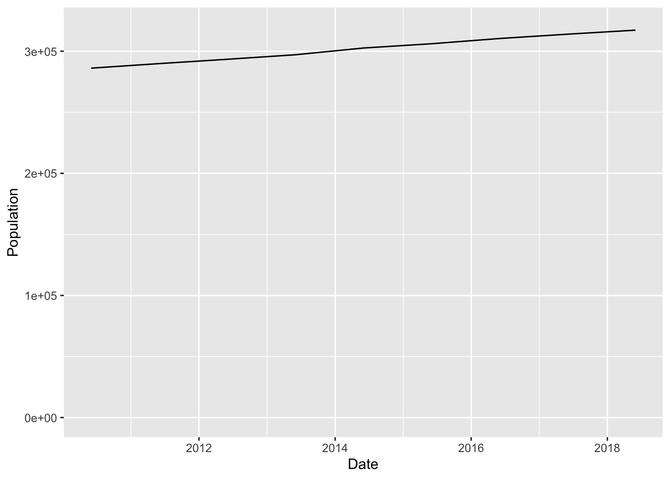
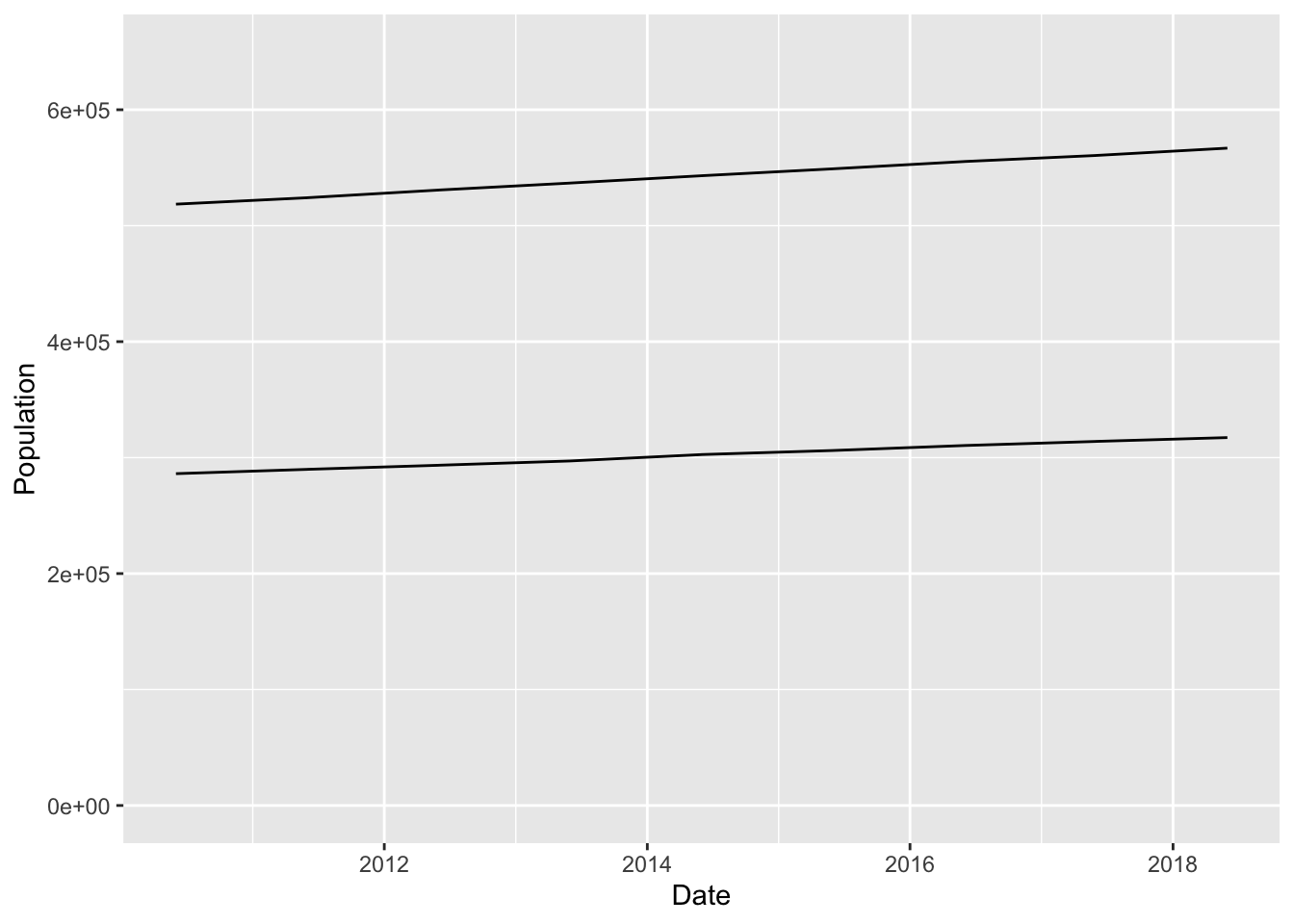
Now, if we tried to make a line chart of all 3,142 counties, we’d get a mess. But, it’s the first mistake people make in creating a line chart, so let’s do that.
And what do we learn from this? There’s one very, very big county, some less big counties, and a ton of smaller counties. So many we can’t see Them, and because the numbers are so big, any changes are dwarfed.
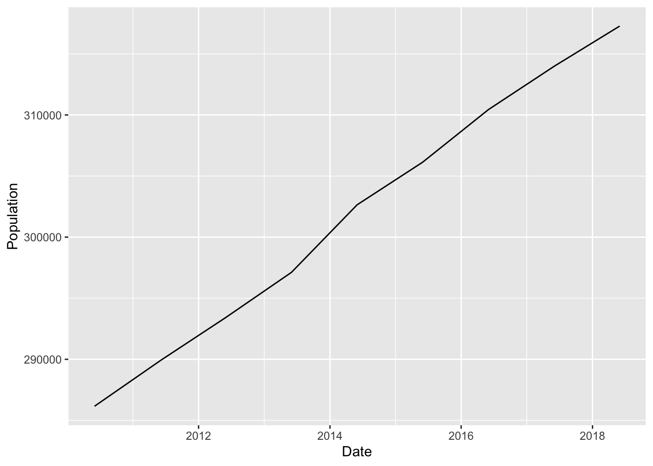
So let’s thin the herd here. How about we just look at Lancaster County, Nebraska.
lancaster <- populationestimates |>filter(Name =="Lancaster County, Nebraska")