library(tidyverse)
library(ggbump)25 Bump charts
The point of a bump chart is to show how the ranking of something changed over time – you could do this with the top 25 in football or basketball. I’ve seen it done with European soccer league standings over a season.
The requirements are that you have a row of data for a team, in that week, with their rank.
This is another extension to ggplot, and you’ll install it the usual way: install.packages("ggbump")
Let’s use last season’s college football playoff rankings (this year wasn’t done as of this writing):
For this walkthrough:
rankings <- read_csv("data/cfbranking.csv")Rows: 125 Columns: 4
── Column specification ────────────────────────────────────────────────────────
Delimiter: ","
chr (2): Team, ShortTeam
dbl (2): Rank, Week
ℹ Use `spec()` to retrieve the full column specification for this data.
ℹ Specify the column types or set `show_col_types = FALSE` to quiet this message.Given our requirements of a row of data for a team, in that week, with their rank, take a look at the data provided. We have 5 weeks of playoff rankings, so we should see a ranking, the week of the ranking and the team at that rank. You can see the basic look of the data by using head()
head(rankings)# A tibble: 6 × 4
Rank Week Team ShortTeam
<dbl> <dbl> <chr> <chr>
1 1 17 Alabama Ala.
2 1 16 Alabama Ala.
3 1 15 Alabama Ala.
4 1 14 Alabama Ala.
5 1 13 Alabama Ala.
6 22 13 Auburn Aub. So Alabama was ranked in the first (yawn), followed by Clemson (double yawn), Ohio State and so on. Our data is in the form we need it to be. Now we can make a bump chart. We’ll start simple.
ggplot() +
  geom_bump(
    data=rankings, aes(x=Week, y=Rank, color=Team))
Warning in compute_group(...): 'StatBump' needs at least two observations per
group
Warning in compute_group(...): 'StatBump' needs at least two observations per
group
Warning in compute_group(...): 'StatBump' needs at least two observations per
group
Well, it’s a start.
The warning that you’re seeing is that there’s three teams last season who made one appearance on the college football playoff rankings and disappeared. Nebraska fans would bite your arm off for that. Alas. We should eliminate them and thin up our chart a little. Let’s just take teams that finished in the top 10. We’re going to use a neat filter trick for this that you learned earlier using %in%.
top10 <- rankings |> filter(Week == 17 & Rank <= 10)

newrankings <- rankings |> filter(Team %in% top10$Team)
Now you have something called newrankings that shows how teams who finished in the top 10 at the end of the season ended up there. And every team who finished in the top 10 in week 17 had been in the rankings more than once in the 5 weeks before.
ggplot() +
  geom_bump(
    data=newrankings, aes(x=Week, y=Rank, color=Team))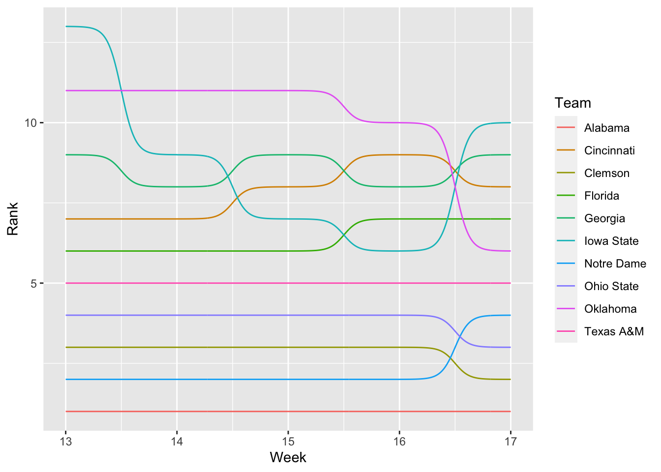
First things first: I’m immediately annoyed by the top teams being at the bottom. I learned a neat trick from ggbump that’s been in ggplot all along – scale_y_reverse()
ggplot() +
  geom_bump(
    data=newrankings, aes(x=Week, y=Rank, color=Team)) +
  scale_y_reverse()
Better. But, still not great. Let’s add a point at each week.
ggplot() +
  geom_bump(data=newrankings, aes(x=Week, y=Rank, color=Team)) +
  geom_point(data=newrankings, aes(x=Week, y=Rank, color=Team), size = 4) +
scale_y_reverse() 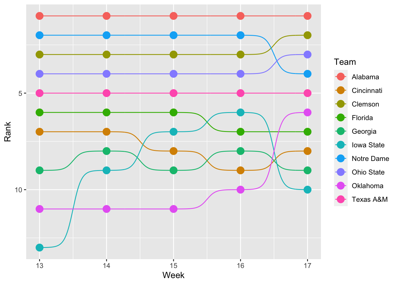
Another step. That makes it more subway-map like. But the colors are all wrong. To fix this, we’re going to use scale_color_manual and we’re going to Google the hex codes for each team. The legend will tell you what order your scale_color_manual needs to be.
ggplot() +
  geom_bump(data=newrankings, aes(x=Week, y=Rank, color=Team)) +
  geom_point(data=newrankings, aes(x=Week, y=Rank, color=Team), size = 4) +
  scale_color_manual(values = c("#9E1B32","#E00122", "#F56600", "#0021A5", "#BA0C2F", "#F1BE48","#C99700", "#bb0000", "#841617", "#500000")) +
scale_y_reverse() 
Another step. But the legend is annoying. And trying to find which red is Alabama vs Ohio State is hard. So what if we labeled each dot at the beginning and end? We can do that with some clever usage of geom_text and a little dplyr filtering inside the data step. We filter out the first and last weeks, then use hjust – horizontal justification – to move them left or right.
ggplot() +
  geom_bump(data=newrankings, aes(x=Week, y=Rank, color=Team)) +
  geom_point(data=newrankings, aes(x=Week, y=Rank, color=Team), size = 4) +
  geom_text(data = newrankings |> filter(Week == min(Week)), aes(x = Week - .2, y=Rank, label = Team), size = 3, hjust = 1) +
  geom_text(data = newrankings |> filter(Week == max(Week)), aes(x = Week + .2, y=Rank, label = Team), size = 3, hjust = 0) +
  scale_color_manual(values = c("#9E1B32","#E00122", "#F56600", "#0021A5", "#BA0C2F", "#F1BE48","#C99700", "#bb0000", "#841617", "#500000")) +
scale_y_reverse() 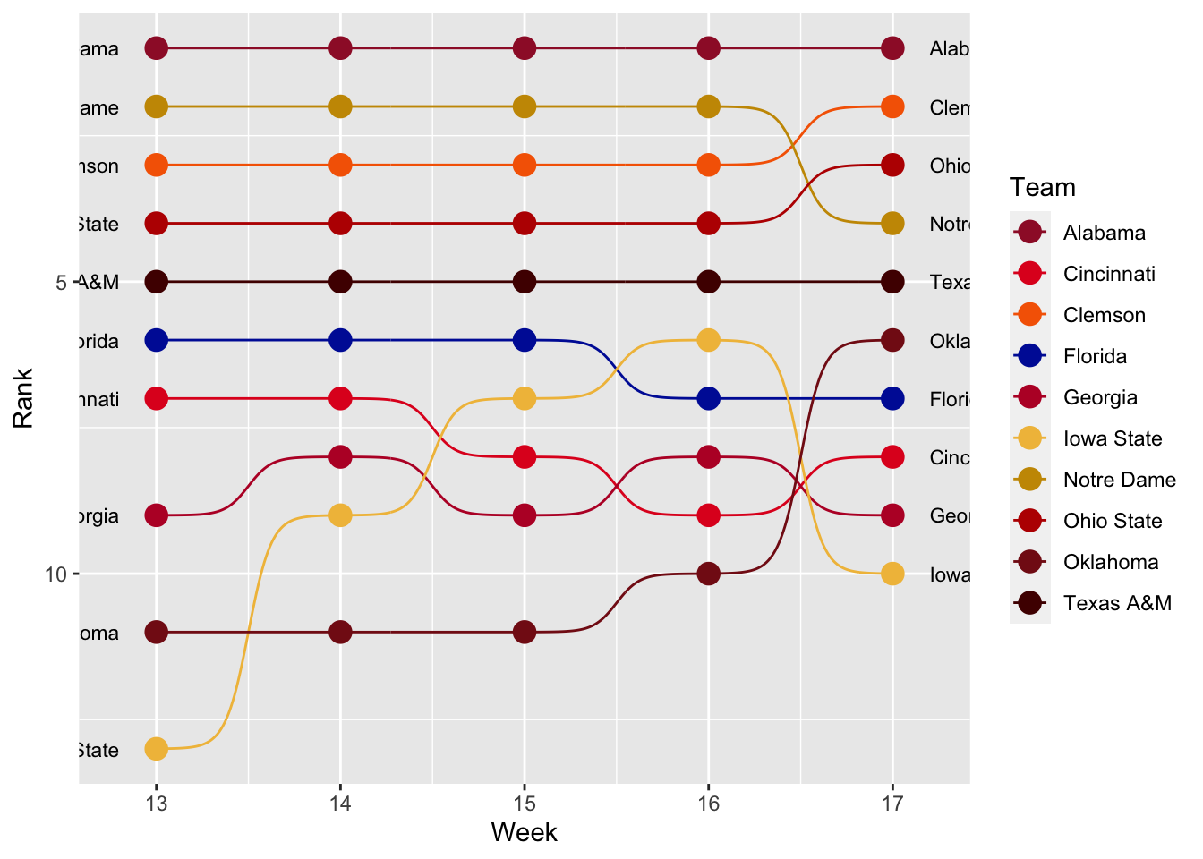
Better, but the legend is still there. We can drop it in a theme directive by saying legend.position = "none". We’ll also throw a theme_minimal on there to drop the default grey, and we’ll add some better labeling.
ggplot() +
  geom_bump(data=newrankings, aes(x=Week, y=Rank, color=Team)) +
  geom_point(data=newrankings, aes(x=Week, y=Rank, color=Team), size = 4) +
  geom_text(data = newrankings |> filter(Week == min(Week)), aes(x = Week - .2, y=Rank, label = ShortTeam), size = 3, hjust = 1) +
  geom_text(data = newrankings |> filter(Week == max(Week)), aes(x = Week + .2, y=Rank, label = ShortTeam), size = 3, hjust = 0) +
  labs(title="Was COVID college football boring?", subtitle="There was no drama at the top. None. So, yes?", y= "Rank", x = "Week") +
  theme_minimal() +
  theme(
    legend.position = "none",
    panel.grid.major = element_blank()
    ) +
  scale_color_manual(values = c("#9E1B32","#E00122", "#F56600", "#0021A5", "#BA0C2F", "#F1BE48","#C99700", "#bb0000", "#841617", "#500000")) +
scale_y_reverse() 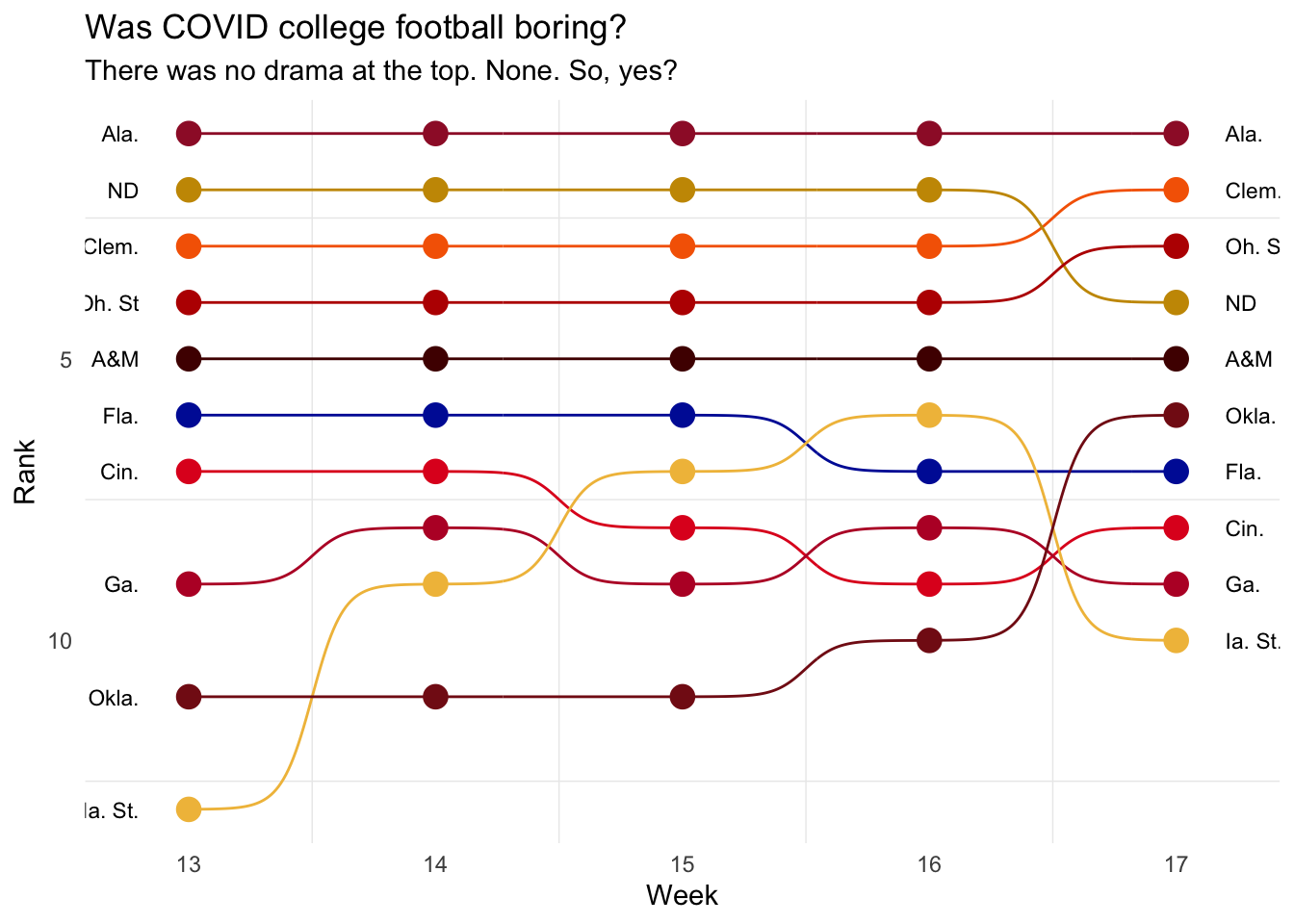
Now let’s fix our text hierarchy.
ggplot() +
  geom_bump(data=newrankings, aes(x=Week, y=Rank, color=Team)) +
  geom_point(data=newrankings, aes(x=Week, y=Rank, color=Team), size = 4) +
  geom_text(data = newrankings |> filter(Week == min(Week)), aes(x = Week - .2, y=Rank, label = ShortTeam), size = 3, hjust = 1) +
  geom_text(data = newrankings |> filter(Week == max(Week)), aes(x = Week + .2, y=Rank, label = ShortTeam), size = 3, hjust = 0) +
  labs(title="Was COVID college football boring?", subtitle="There was no drama at the top. None. So, yes?", y= "Rank", x = "Week") +
  theme_minimal() +
  theme(
    legend.position = "none",
    panel.grid.major = element_blank(),
    plot.title = element_text(size = 16, face = "bold"),
    axis.title = element_text(size = 8),
    plot.subtitle = element_text(size=10),
    panel.grid.minor = element_blank()
    ) +
  scale_color_manual(values = c("#9E1B32","#E00122", "#F56600", "#0021A5", "#BA0C2F", "#F1BE48","#C99700", "#bb0000", "#841617", "#500000")) +
scale_y_reverse() 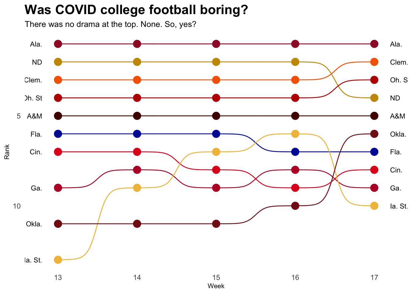
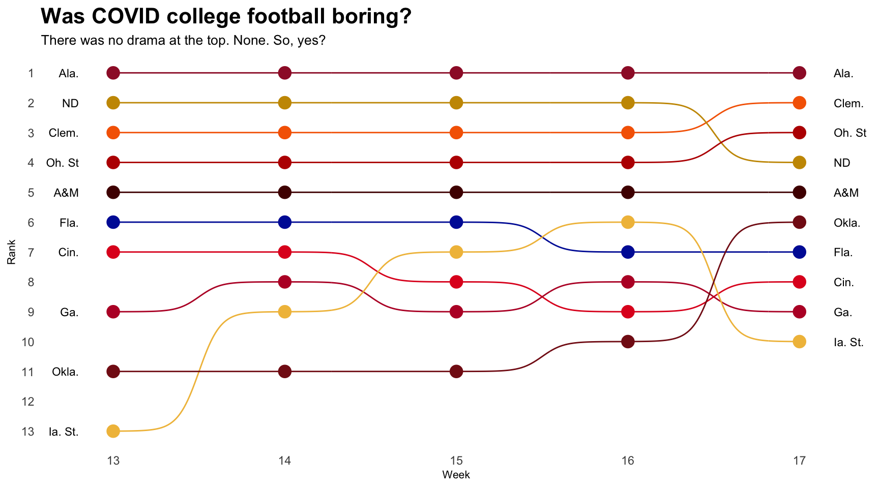
And the last thing: anyone else annoyed at 7.5th place on the left? We can fix that too by specifying the breaks in scale_y_reverse. We can do that with the x axis as well, but since we haven’t reversed it, we do that in scale_x_continuous with the same breaks. Also: forgot my source and credit line.
One last thing: Let’s change the width of the chart to make the names fit. We can do that by adding fig.width=X in the {r} setup in your block. So something like this:
ggplot() +
  geom_bump(data=newrankings, aes(x=Week, y=Rank, color=Team)) +
  geom_point(data=newrankings, aes(x=Week, y=Rank, color=Team), size = 4) +
  geom_text(data = newrankings |> filter(Week == min(Week)), aes(x = Week - .2, y=Rank, label = ShortTeam), size = 3, hjust = 1) +
  geom_text(data = newrankings |> filter(Week == max(Week)), aes(x = Week + .2, y=Rank, label = ShortTeam), size = 3, hjust = 0) +
  labs(title="Was COVID college football boring?", subtitle="There was no drama at the top. None. So, yes?", y= "Rank", x = "Week") +
  theme_minimal() +
  theme(
    legend.position = "none",
    panel.grid.major = element_blank(),
    plot.title = element_text(size = 16, face = "bold"),
    axis.title = element_text(size = 8),
    plot.subtitle = element_text(size=10),
    panel.grid.minor = element_blank()
    ) +
  scale_color_manual(values = c("#9E1B32","#E00122", "#F56600", "#0021A5", "#BA0C2F", "#F1BE48","#C99700", "#bb0000", "#841617", "#500000")) +
  scale_x_continuous(breaks=c(13,14,15,16,17)) +
  scale_y_reverse(breaks=c(1,2,3,4,5,6,7,8,9,10,11,12,13,14,15))