library(tidyverse)
library(cowplot)28 Arranging multiple plots together
Sometimes you have two or three (or more) charts that by themselves aren’t very exciting and are really just one chart that you need to merge together. It would be nice to be able to arrange them programmatically and not have to mess with it in Adobe Illustrator.
Good news.
There is.
It’s called cowplot, and it’s pretty easy to use. First install cowplot with install.packages("cowplot"). Then let’s load tidyverse and cowplot.
We’ll use the college football attendance data we’ve used before.
For this walkthrough:
And load it.
attendance <- read_csv("data/attendance.csv")Rows: 150 Columns: 8
── Column specification ────────────────────────────────────────────────────────
Delimiter: ","
chr (2): Institution, Conference
dbl (6): 2013, 2014, 2015, 2016, 2017, 2018
ℹ Use `spec()` to retrieve the full column specification for this data.
ℹ Specify the column types or set `show_col_types = FALSE` to quiet this message.Making a quick percent change.
attendance <- attendance |> mutate(change = ((`2018`-`2017`)/`2017`)*100)Let’s chart the top 10 and bottom 10 of college football ticket growth … and shrinkage.
top10 <- attendance |> top_n(10, wt=change)
bottom10 <- attendance |> top_n(10, wt=-change)
Okay, now to do this I need to save my plots to an object. We do this the same way we save things to a dataframe – with the arrow. We’ll make two identical bar charts, one with the top 10 and one with the bottom 10.
bar1 <- ggplot() +
  geom_bar(data=top10, aes(x=reorder(Institution, change), weight=change)) +
  coord_flip()
bar2 <- ggplot() +
geom_bar(data=bottom10, aes(x=reorder(Institution, change), weight=change)) +
coord_flip()With cowplot, we can use a function called plot_grid to arrange the charts:
plot_grid(bar1, bar2) 
We can also stack them on top of each other:
plot_grid(bar1, bar2, ncol=1) 
To make these publishable, we should add headlines, chatter, decent labels, credit lines, etc. But to do this, we’ll have to figure out which labels go on which charts, so we can make it look decent. For example – both charts don’t need x or y labels. If you don’t have a title and subtitle on both, the spacing is off, so you need to leave one blank or the other blank. You’ll just have to fiddle with it until you get it looking right.
bar1 <- ggplot() +
  geom_bar(data=top10, aes(x=reorder(Institution, change), weight=change)) +
  coord_flip() +
  labs(title="College football winners...", subtitle = "Not every football program saw attendance shrink in 2018. But some really did.",  x="", y="Percent change", caption = "") +
  theme_minimal() +
  theme(
    plot.title = element_text(size = 16, face = "bold"),
    axis.title = element_text(size = 8),
    plot.subtitle = element_text(size=10),
    panel.grid.minor = element_blank()
    )
bar2 <- ggplot() +
geom_bar(data=bottom10, aes(x=reorder(Institution, change), weight=change)) +
coord_flip() +
labs(title = "... and losers", subtitle= "", x="", y="", caption="Source: NCAA | By Matt Waite") +
theme_minimal() +
theme(
plot.title = element_text(size = 16, face = "bold"),
axis.title = element_text(size = 8),
plot.subtitle = element_text(size=10),
panel.grid.minor = element_blank()
)plot_grid(bar1, bar2) 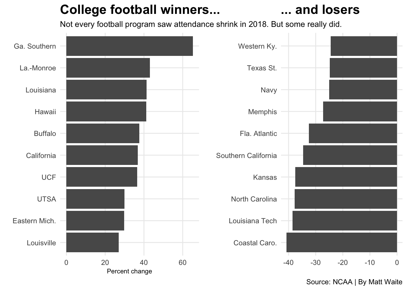
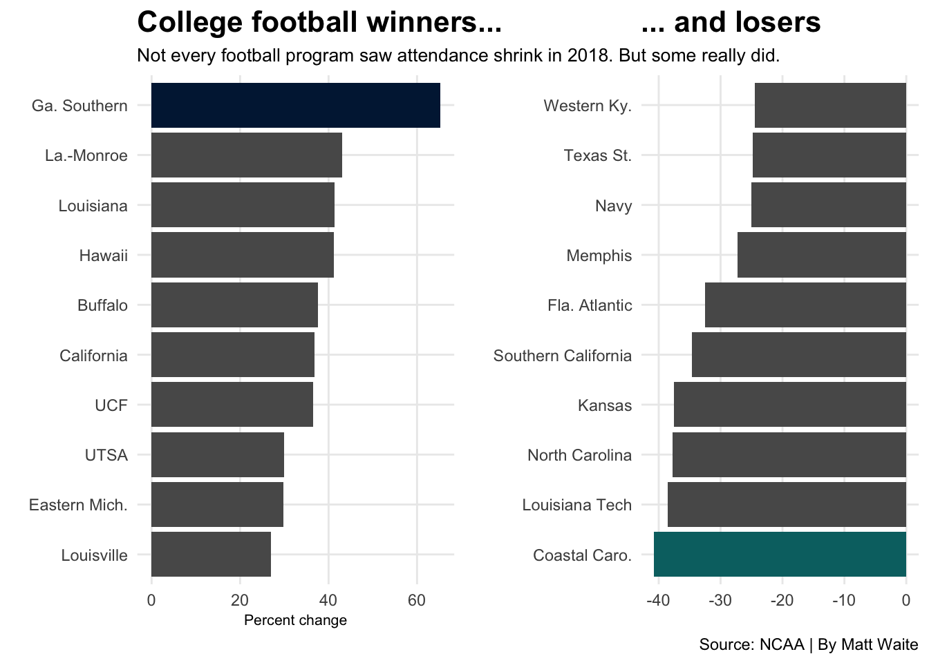
What’s missing here? Color. Our eyes aren’t drawn to anything (except maybe the top and bottom). So we need to help that. A bar chart without context or color to draw attention to something isn’t much of a bar chart. Same with a line chart – if your line chart has one line, no context, no color, it’s going to fare poorly.
cc <- bottom10 |> filter(Institution == "Coastal Caro.")
gs <- top10 |> filter(Institution == "Ga. Southern")
bar1 <- ggplot() +
geom_bar(data=top10, aes(x=reorder(Institution, change), weight=change)) +
geom_bar(data=gs, aes(x=reorder(Institution, change), weight=change), fill="#011E41") +
coord_flip() +
labs(title="College football winners...", subtitle = "Not every football program saw attendance shrink in 2018. But some really did.", x="", y="Percent change", caption = "") +
theme_minimal() +
theme(
plot.title = element_text(size = 16, face = "bold"),
axis.title = element_text(size = 8),
plot.subtitle = element_text(size=10),
panel.grid.minor = element_blank()
)bar2 <- ggplot() +
geom_bar(data=bottom10, aes(x=reorder(Institution, change), weight=change)) +
geom_bar(data=cc, aes(x=reorder(Institution, change), weight=change), fill="#006F71") +
coord_flip() +
labs(title = "... and losers", subtitle= "", x="", y="", caption="Source: NCAA | By Matt Waite") +
theme_minimal() +
theme(
plot.title = element_text(size = 16, face = "bold"),
axis.title = element_text(size = 8),
plot.subtitle = element_text(size=10),
panel.grid.minor = element_blank()
)plot_grid(bar1, bar2)