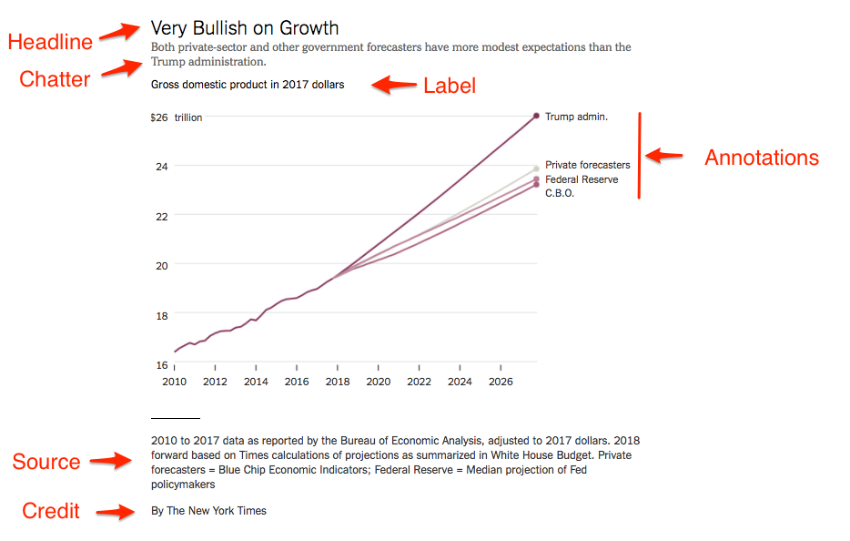
33 Finishing touches
The output from ggplot is good, but not great. We need to add some pieces to it. The elements of a good graphic are:
- Headline
- Chatter
- The main body
- Annotations
- Labels
- Source line
- Credit line
That looks like:
33.1 Graphics vs visual stories
While the elements above are nearly required in every chart, they aren’t when you are making visual stories.
- When you have a visual story, things like credit lines can become a byline.
- In visual stories, source lines are often a note at the end of the story.
- Graphics don’t always get headlines – sometimes just labels, letting the visual story headline carry the load.
An example from The Upshot. Note how the charts don’t have headlines, source or credit lines.
33.2 Getting ggplot closer to output
Let’s explore fixing up ggplot’s output before we send it to a finishing program like Adobe Illustrator. We’ll need a graphic to work with first.
library(tidyverse)
library(ggrepel)
Here’s the data we’ll use:
For this walkthrough:
Let’s load them and join them together.
scoring <- read_csv("data/scoringoffense.csv")Rows: 1253 Columns: 10
── Column specification ────────────────────────────────────────────────────────
Delimiter: ","
chr (1): Name
dbl (9): G, TD, FG, 1XP, 2XP, Safety, Points, Points/G, Year
ℹ Use `spec()` to retrieve the full column specification for this data.
ℹ Specify the column types or set `show_col_types = FALSE` to quiet this message.total <- read_csv("data/totaloffense.csv")Rows: 1253 Columns: 9
── Column specification ────────────────────────────────────────────────────────
Delimiter: ","
chr (1): Name
dbl (8): G, Rush Yards, Pass Yards, Plays, Total Yards, Yards/Play, Yards/G,...
ℹ Use `spec()` to retrieve the full column specification for this data.
ℹ Specify the column types or set `show_col_types = FALSE` to quiet this message.offense <- total |> left_join(scoring, by=c("Name", "Year"))We’re going to need this later, so let’s grab Nebraska’s 2018 stats from this dataframe.
nu <- offense |>
  filter(Name == "Nebraska") |>
  filter(Year == 2018)
We’ll start with the basics.
ggplot() +
  geom_point(data=offense, aes(x=`Yards/G`, y=`Points/G`), color="grey")
Let’s take changing things one by one. The first thing we can do is change the figure size. Sometimes you don’t want a square. We can use the knitr output settings in our chunk to do this easily in our notebooks.
ggplot() +
  geom_point(data=offense, aes(x=`Yards/G`, y=`Points/G`), color="grey")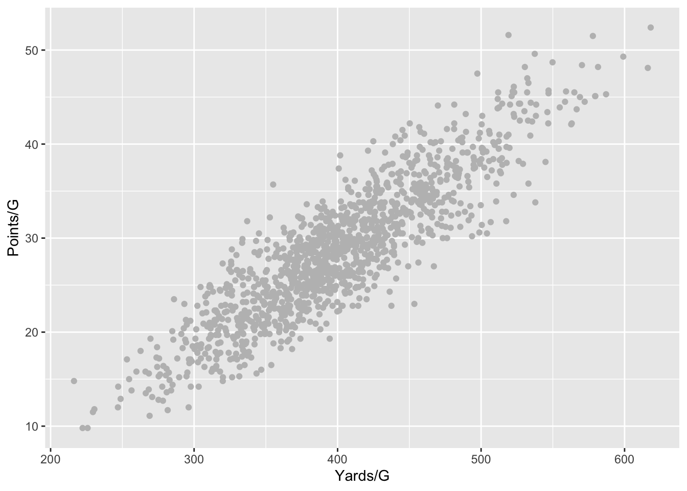
Now let’s add a fit line.
ggplot() +
  geom_point(data=offense, aes(x=`Yards/G`, y=`Points/G`), color="grey") +
  geom_smooth(data=offense, aes(x=`Yards/G`, y=`Points/G`), method=lm, se=FALSE)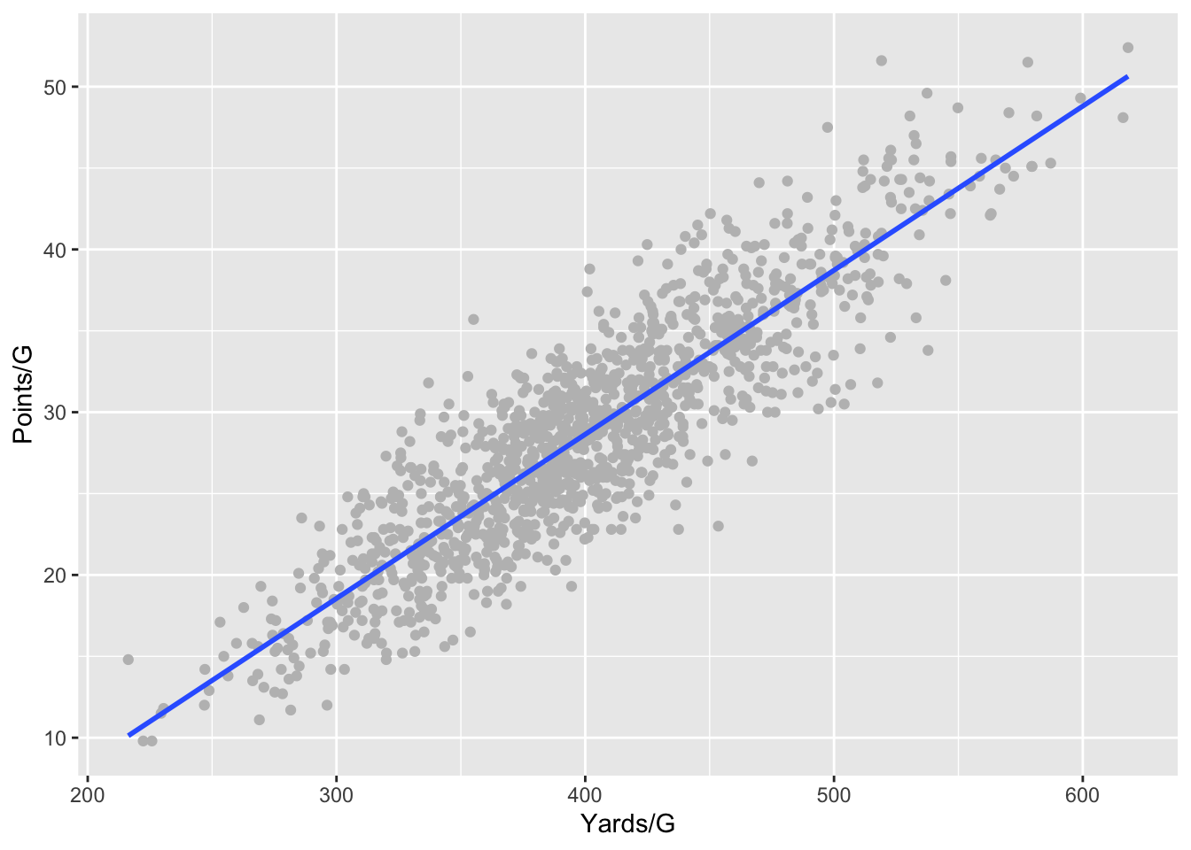
And now some labels.
ggplot() +
  geom_point(data=offense, aes(x=`Yards/G`, y=`Points/G`), color="grey") +
  geom_smooth(data=offense, aes(x=`Yards/G`, y=`Points/G`), method=lm, se=FALSE) +
  labs(
    x="Total yards per game",
    y="Points per game",
    title="Nebraska's underperforming offense",
    subtitle="The Husker's offense was the strength of the team. They underperformed.",
    caption="Source: NCAA | By Matt Waite"
    )
Let’s get rid of the default plot look and drop the grey background.
ggplot() +
  geom_point(data=offense, aes(x=`Yards/G`, y=`Points/G`), color="grey") +
  geom_smooth(data=offense, aes(x=`Yards/G`, y=`Points/G`), method=lm, se=FALSE) +
  labs(
    x="Total yards per game",
    y="Points per game",
    title="Nebraska's underperforming offense",
    subtitle="The Husker's offense was the strength of the team. They underperformed.",
    caption="Source: NCAA | By Matt Waite"
    ) +
  theme_minimal()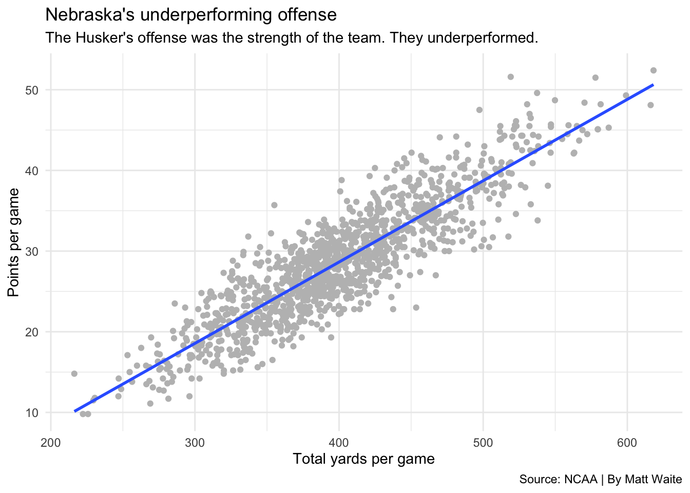
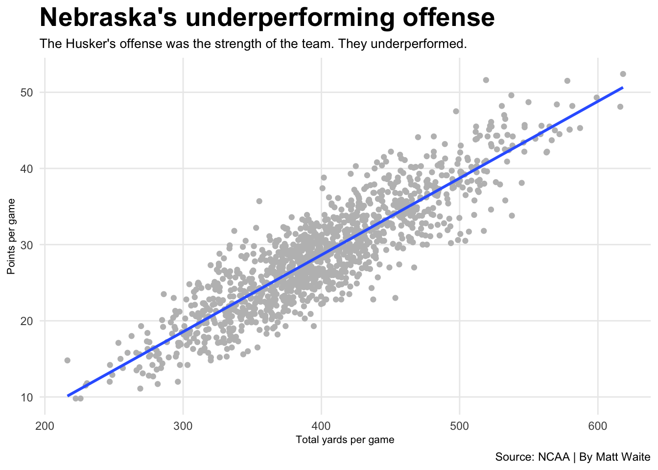
Off to a good start, but our text has no real heirarchy. We’d want our headline to stand out more. So let’s change that. When it comes to changing text, the place to do that is in the theme element. There are a lot of ways to modify the theme. We’ll start easy. Let’s make the headline bigger and bold.
ggplot() +
  geom_point(data=offense, aes(x=`Yards/G`, y=`Points/G`), color="grey") +
  geom_smooth(data=offense, aes(x=`Yards/G`, y=`Points/G`), method=lm, se=FALSE) +
  labs(
    x="Total yards per game",
    y="Points per game",
    title="Nebraska's underperforming offense",
    subtitle="The Husker's offense was the strength of the team. They underperformed.",
    caption="Source: NCAA | By Matt Waite") +
  theme_minimal() +
  theme(
    plot.title = element_text(size = 20, face = "bold")
) 
Now let’s fix a few other things – like the axis labels being too big, the subtitle could be bigger and lets drop some grid lines.
ggplot() +
  geom_point(data=offense, aes(x=`Yards/G`, y=`Points/G`), color="grey") +
  geom_smooth(data=offense, aes(x=`Yards/G`, y=`Points/G`), method=lm, se=FALSE) +
  labs(
    x="Total yards per game",
    y="Points per game",
    title="Nebraska's underperforming offense",
    subtitle="The Husker's offense was the strength of the team. They underperformed.",
    caption="Source: NCAA | By Matt Waite") +
  theme_minimal() +
  theme(
    plot.title = element_text(size = 20, face = "bold"),
    axis.title = element_text(size = 8),
    plot.subtitle = element_text(size=10),
    panel.grid.minor = element_blank()
) 
Missing from this graph is the context that the headline promises. Where is Nebraska? We haven’t added it yet. So let’s add a point and a label for it.
ggplot() +
  geom_point(data=offense, aes(x=`Yards/G`, y=`Points/G`), color="grey") +
  geom_smooth(data=offense, aes(x=`Yards/G`, y=`Points/G`), method=lm, se=FALSE) +
  labs(
    x="Total yards per game",
    y="Points per game",
    title="Nebraska's underperforming offense",
    subtitle="The Husker's offense was the strength of the team. They underperformed.",
    caption="Source: NCAA | By Matt Waite") +
  theme_minimal() +
  theme(
    plot.title = element_text(size = 16, face = "bold"),
    axis.title = element_text(size = 8),
    plot.subtitle = element_text(size=10),
    panel.grid.minor = element_blank()
    ) +
  geom_point(data=nu, aes(x=`Yards/G`, y=`Points/G`), color="red") +
  geom_text_repel(data=nu, aes(x=`Yards/G`, y=`Points/G`, label="Nebraska 2018"))
If we’re happy with this output – if it meets all of our needs for publication – then we can simply export it as a png file. We do that by adding + ggsave("plot.png", width=5, height=2) to the end of our code. Note the width and the height are from our knitr parameters at the top – you have to repeat them or the graph will export at the default 7x7.
If there’s more work you want to do with this graph that isn’t easy or possible in R but is in Illustrator, simply change the file extension to pdf instead of png. The pdf will open as a vector file in Illustrator with everything being fully editable.
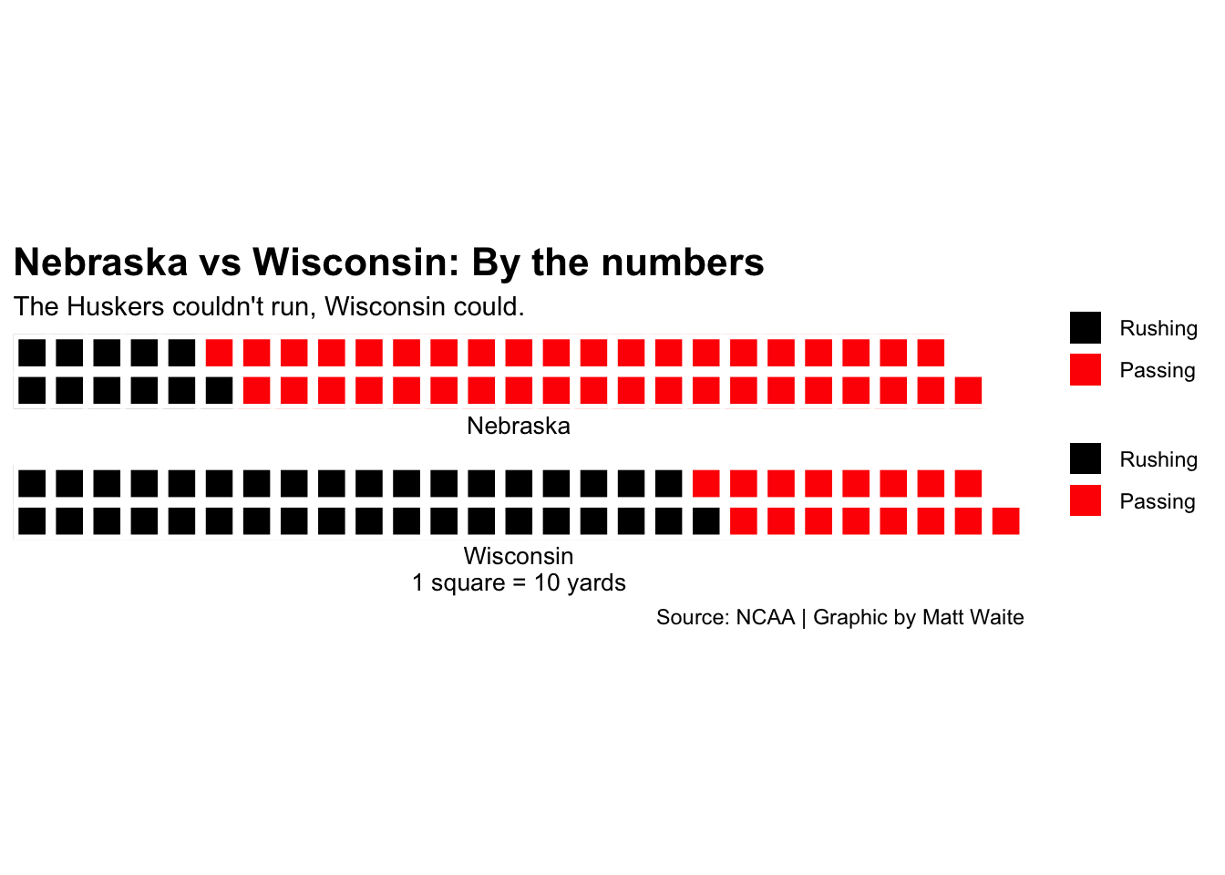
33.3 Waffle charts require special attention
Frequently in my classes, students use the waffle charts library quite extensively to make graphics. This is a quick walkthough on how to get a waffle chart into a publication ready state.
library(waffle)Let’s look at the offensive numbers from the 2018 Nebraska v. Wisconsin football game. Nebraska lost 41-24, but Wisconsin gained only 15 yards more than Nebraska did. You can find the official stats on the NCAA’s website.
I’m going to make two vectors for each team and record rushing yards and passing yards.
ne <- c("Rushing"=111, "Passing"=407, 15)
wi <- c("Rushing"=370, "Passing"=163, 0)
So what does the breakdown of Nebraska’s night look like? How balanced was the offense?
The waffle library can break this down in a way that’s easier on the eyes than a pie chart. We call the library, add the data, specify the number of rows, give it a title and an x value label, and to clean up a quirk of the library, we’ve got to specify colors.
ADDITIONALLY
We can add labels and themes, but you have to be careful. The waffle library is applying it’s own theme, but if we override something they are using in their theme, some things that are hidden come back and make it worse. So here is an example of how to use ggplot’s labs and the theme to make a fully publication ready graphic.
waffle(ne/10, rows = 5, xlab="1 square = 10 yards", colors = c("black", "red", "white")) +
  labs(
    title="Nebraska vs Wisconsin on offense",
    subtitle="The Huskers couldn't get much of a running game going.",
    caption="Source: NCAA | Graphic by Matt Waite") +
  theme(
    plot.title = element_text(size = 16, face = "bold"),
    axis.title = element_text(size = 10),
    axis.title.y = element_blank()
  )
But what if we’re using a waffle iron? And what if we want to change the output size? It gets tougher.
Truth is, I’m not sure what is going on with the sizing. You can try it and you’ll find that the outputs are … unpredictable.
Things you need to know about waffle irons:
- They’re a convenience method, but all they’re really doing is executing two waffle charts together. If you don’t apply the theme to both waffle charts, it breaks.
- You will have to get creative about applying headline and subtitle to the top waffle chart and the caption to the bottom.
- Using ggsave doesn’t work either. So you’ll have to use R’s pdf output.
Here is a full example. I start with my waffle iron code, but note that each waffle is pretty much a self contained thing. That’s because a waffle iron isn’t really a thing. It’s just a way to group waffles together, so you have to make each waffle individually. My first waffle has the title and subtitle but no x axis labels and the bottom one has not title or subtitle but the axis labels and the caption.
iron(
 waffle(
   ne/10,
   rows = 2,
   xlab="Nebraska",
   colors = c("black", "red", "white")) +
   labs(
     title="Nebraska vs Wisconsin: By the numbers",
     subtitle="The Huskers couldn't run, Wisconsin could.") +
   theme(
    plot.title = element_text(size = 16, face = "bold"),
    axis.title = element_text(size = 10),
    axis.title.y = element_blank()
  ),
 waffle(
   wi/10,
   rows = 2,
   xlab="Wisconsin\n1 square = 10 yards",
   colors = c("black", "red", "white")) +
   labs(caption="Source: NCAA | Graphic by Matt Waite")
) 
33.4 Advanced text wrangling
Sometimes, you need a little more help with text than what is easily available. Sometimes you want a little more in your finishing touches. Let’s work on some issues common in projects that can be fixed with new new libraries: multi-line chatter, axis labels that need more than just a word, axis labels that don’t fit, and additional text boxes.
First things first, we’ll need to install ggtext with install.packages. Then we’ll load it.
library(ggtext)Let’s bo back to our scatterplot above. As created, it’s very simple, and the chatter doesn’t say much. Let’s write chatter that instead of being super spare is more verbose.
ggplot() +
  geom_point(data=offense, aes(x=`Yards/G`, y=`Points/G`), color="grey") +
  geom_smooth(data=offense, aes(x=`Yards/G`, y=`Points/G`), method=lm, se=FALSE) +
  labs(
    x="Total yards per game",
    y="Points per game",
    title="Nebraska's underperforming offense",
    subtitle="The Husker's offense was the strength of the team, having to overcome a defense changing systems and struggling to stop opponents. But if you compare the offense to every other offense and how many points they score vs the number of yards they roll up, NU underperformed.",
    caption="Source: NCAA | By Matt Waite") +
  theme_minimal() +
  theme(
    plot.title = element_text(size = 16, face = "bold"),
    axis.title = element_text(size = 8),
    plot.subtitle = element_text(size=10),
    panel.grid.minor = element_blank()
    ) +
  geom_point(data=nu, aes(x=`Yards/G`, y=`Points/G`), color="red") +
  geom_text_repel(data=nu, aes(x=`Yards/G`, y=`Points/G`, label="Nebraska 2018"))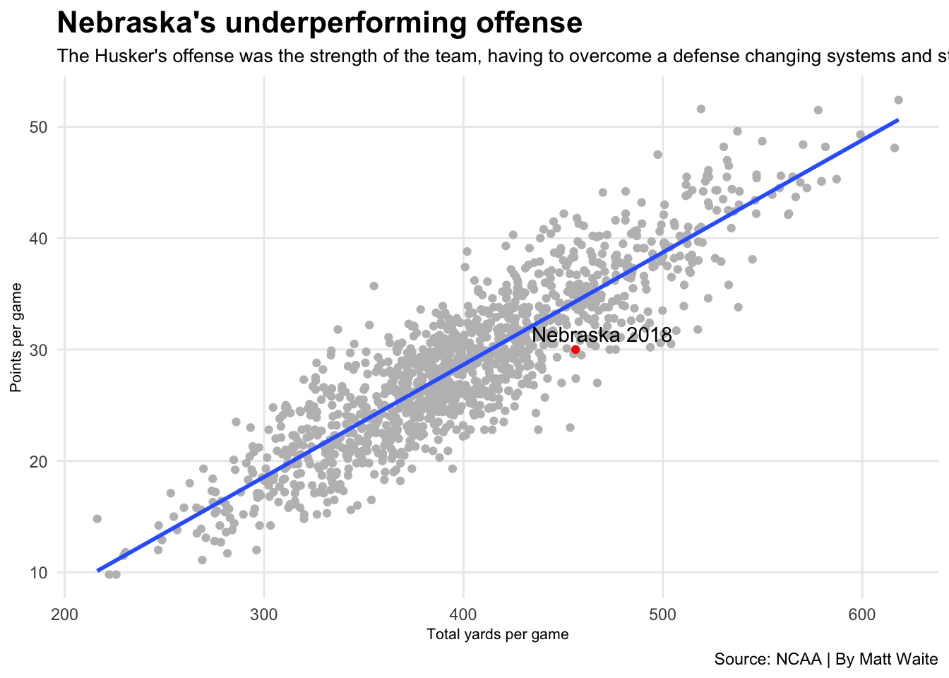
You can see the problem right away – it’s too long and gets cut off. One way to fix this is to put \n where you think the line break should be. That’s a newline character, so it would add a return there. But with ggtext, you can use simple HTML to style the text, which opens up a lot of options. We can use a
to break the line and we can use * to italicize the word “underperformed” to add emphasis. The other thing we need to do is in the theme element, change the element_text for plot.subtitle to element_markdown.
ggplot() +
  geom_point(data=offense, aes(x=`Yards/G`, y=`Points/G`), color="grey") +
  geom_smooth(data=offense, aes(x=`Yards/G`, y=`Points/G`), method=lm, se=FALSE) +
  labs(
    x="Total yards per game",
    y="Points per game",
    title="Nebraska's underperforming offense",
    subtitle="The Husker's offense was the strength of the team, having to overcome a defense changing systems and struggling to stop opponents. But if you compare<br>the offense to every other offense and how many points they score vs the number of yards they roll up, NU *underperformed*.",
    caption="Source: NCAA | By Matt Waite") +
  theme_minimal() +
  theme(
    plot.title = element_text(size = 16, face = "bold"),
    axis.title = element_text(size = 8),
    plot.subtitle = element_markdown(size=10),
    panel.grid.minor = element_blank()
    ) +
  geom_point(data=nu, aes(x=`Yards/G`, y=`Points/G`), color="red") +
  geom_text_repel(data=nu, aes(x=`Yards/G`, y=`Points/G`, label="Nebraska 2018"))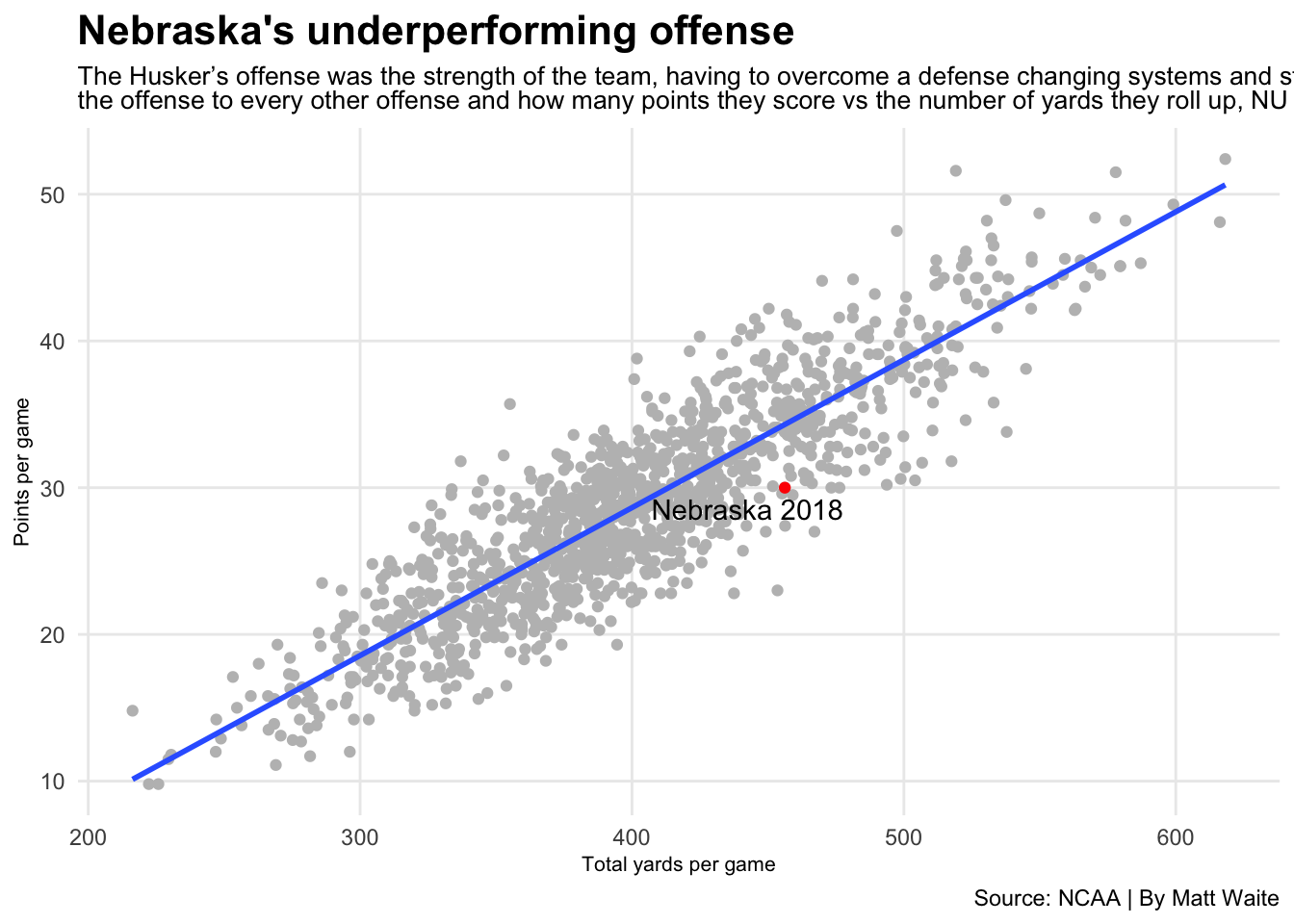
With ggtext, there’s a lot more you can do with CSS, like change the color of text, that I don’t recommend. Also, there’s only a few HTML tags that have been implemented. For example, you can’t add links because the a tag hasn’t been added.
Another sometimes useful thing you can do is add much more explanation to your axis labels. This is going to be a silly example because “Points per game” is pretty self-explanatory, but roll with it. First, we create an unusually long y axis label, then, in theme, we add some code to axis.title.y.
ggplot() +
  geom_point(data=offense, aes(x=`Yards/G`, y=`Points/G`), color="grey") +
  geom_smooth(data=offense, aes(x=`Yards/G`, y=`Points/G`), method=lm, se=FALSE) +
  labs(
    x="Total yards per game",
    y="Points per game is an imperfect metric of offensive efficiency because defenses and special teams score points as well.",
    title="Nebraska's underperforming offense",
    subtitle="The Husker's offense was the strength of the team, having to overcome a defense changing systems and struggling to stop opponents. But if you compare<br>the offense to every other offense and how many points they score vs the number of yards they roll up, NU *underperformed*.",
    caption="Source: NCAA | By Matt Waite") +
  theme_minimal() +
  theme(
    plot.title = element_text(size = 16, face = "bold"),
    axis.title = element_text(size = 8),
    plot.subtitle = element_markdown(size=10),
    panel.grid.minor = element_blank(),
    axis.title.y = element_textbox_simple(
      orientation = "left-rotated",
      width = grid::unit(2.5, "in")
    )
    ) +
  geom_point(data=nu, aes(x=`Yards/G`, y=`Points/G`), color="red") +
  geom_text_repel(data=nu, aes(x=`Yards/G`, y=`Points/G`, label="Nebraska 2018"))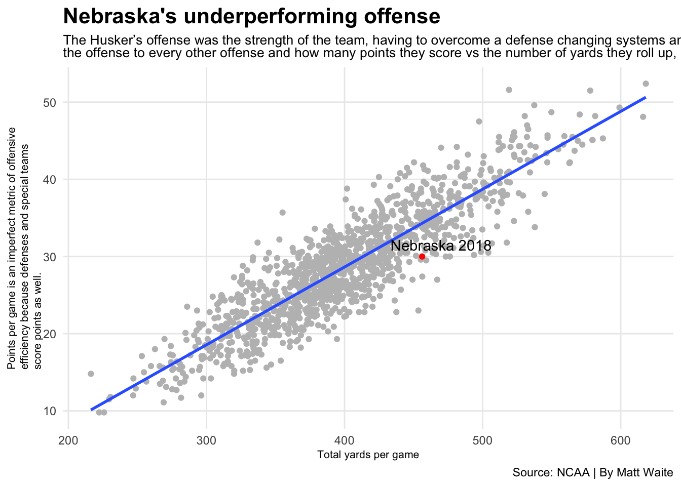
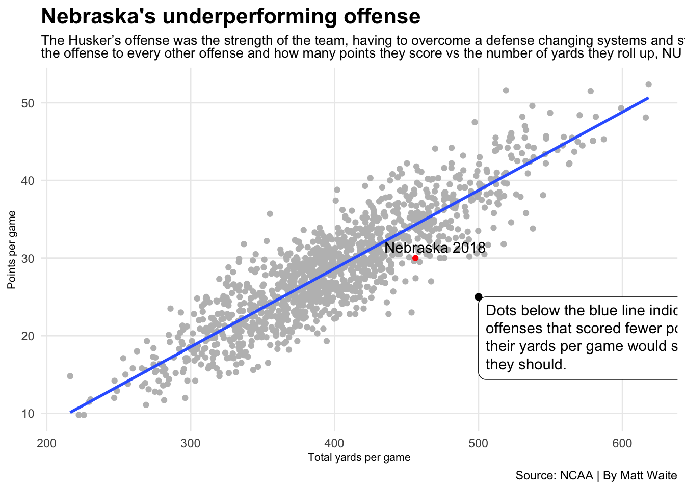
One last advanced trick: Adding a text box explainer in the graphic. This should be used in somewhat rare circumstances – you don’t want to pollute your data space with lots of text. If your graphic needs so much explainer text, you should be asking yourself hard questions about if your chart is clearly telling a story.
To add a text box explainer, you need to add a geom_textbox to your chart. The code below does that, and also adds a geom_point to anchor the box to a spot.
ggplot() +
  geom_point(data=offense, aes(x=`Yards/G`, y=`Points/G`), color="grey") +
  geom_smooth(data=offense, aes(x=`Yards/G`, y=`Points/G`), method=lm, se=FALSE) +
  geom_textbox(
    aes(x=500,
        y=25,
        label="Dots below the blue line indicate offenses that scored fewer points than their yards per game would suggest they should.",
        orientation = "upright",
        hjust=0,
        vjust=1), width = unit(2.8, "in")) +
  geom_point(aes(x=500, y=25), size=2) +
  labs(
    x="Total yards per game",
    y="Points per game",
    title="Nebraska's underperforming offense",
    subtitle="The Husker's offense was the strength of the team, having to overcome a defense changing systems and struggling to stop opponents. But if you compare<br>the offense to every other offense and how many points they score vs the number of yards they roll up, NU *underperformed*.",
    caption="Source: NCAA | By Matt Waite") +
  theme_minimal() +
  theme(
    plot.title = element_text(size = 16, face = "bold"),
    axis.title = element_text(size = 8),
    plot.subtitle = element_markdown(size=10),
    panel.grid.minor = element_blank()
    ) +
  geom_point(data=nu, aes(x=`Yards/G`, y=`Points/G`), color="red") +
  geom_text_repel(data=nu, aes(x=`Yards/G`, y=`Points/G`, label="Nebraska 2018"))